
Percona Monitoring and Management is a great open source database monitoring, observability, and management tool. Query analytics is one of the prominent features DBA uses actively to trace the incidents and query performance identification.
We all know and love the Query Analytics (QAN) dashboard… It’s the first place we look when an incident alert fires or when a developer asks, “Why is the app slow?” or “What was going on during the midnight production outage?”
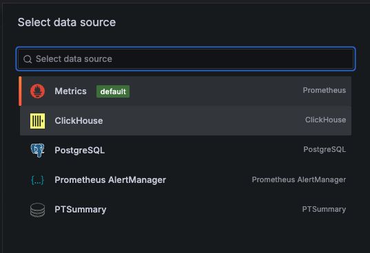
But sometimes, the standard dashboards just don’t tell the whole story or maybe are not clear enough. QAN is great, but shouldn’t we have more? If you have PMM running, you already have a Ferrari engine under the hood: ClickHouse. Most of us just drive it in first gear using the default UI.
In this post, we are going to take the training wheels off. We will bypass the standard QAN interface and talk directly to the ClickHouse backend to build highly specialised dashboards. We aren’t just looking for “slow” queries anymore; we are hunting for inefficiency, volatility, and the “silent killers” that standard monitoring often misses.
This is the hands-on blog, so grab your coffee and let’s turn that PMM instance into a deep-dive forensic tool.
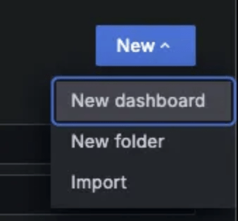
Create a New Dashboard in PMM
|
1 2 3 4 5 6 7 |
SELECT fingerprint FROM pmm.metrics WHERE service_type = 'mysql' AND $__timeFilter(period_start) GROUP BY fingerprint ORDER BY sum(m_query_time_sum) DESC LIMIT 10 |
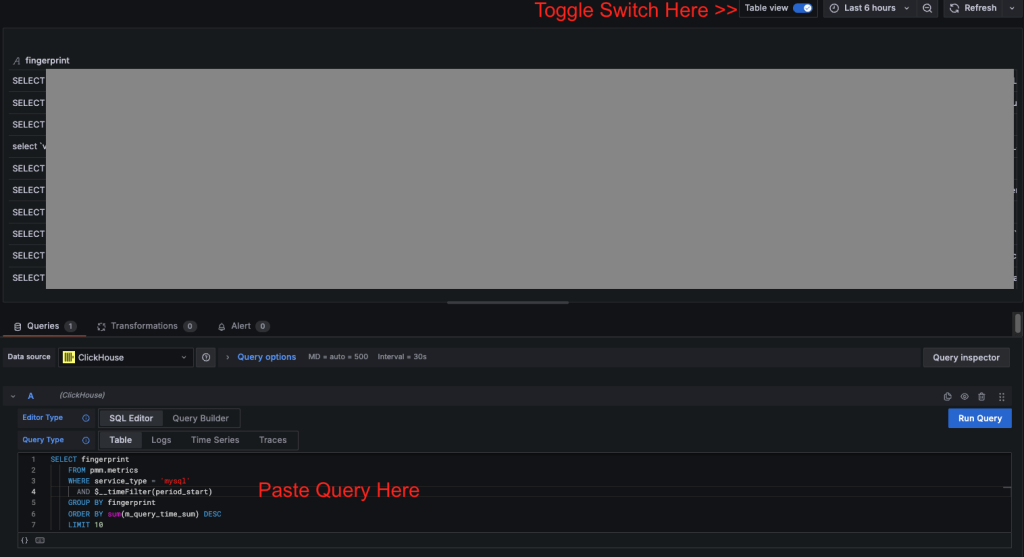
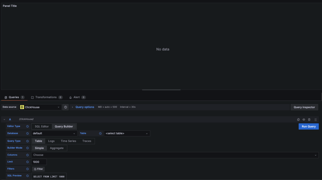
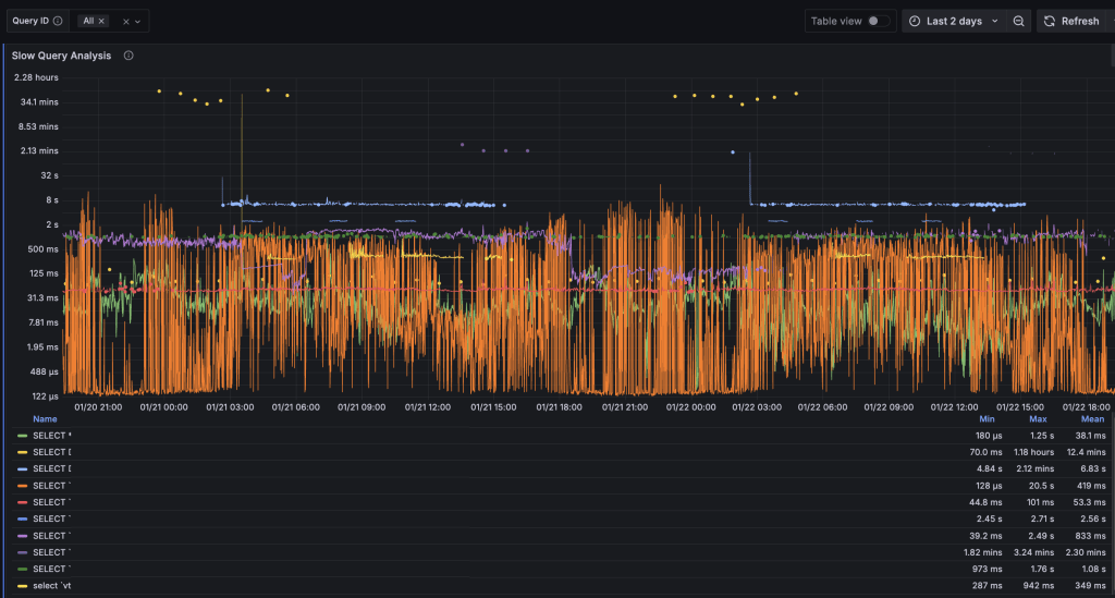
 Alright, we’re at our first step. This first result set shows the top 10 slow query fingerprints across all MySQL services tracked by PMM for the selected time range. It provides a quick, environment-wide view of the most expensive query patterns. But this does not provide a clear picture. Let’s refine the dashboard to focus on specific queries, servers and observe their performance over time.Now, let’s introduce a variable to filter the data.
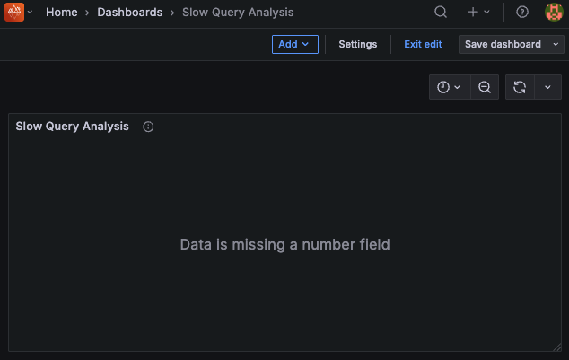 8.1 Choose “Variables” tab and click on “Add Variable”
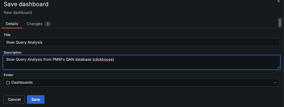
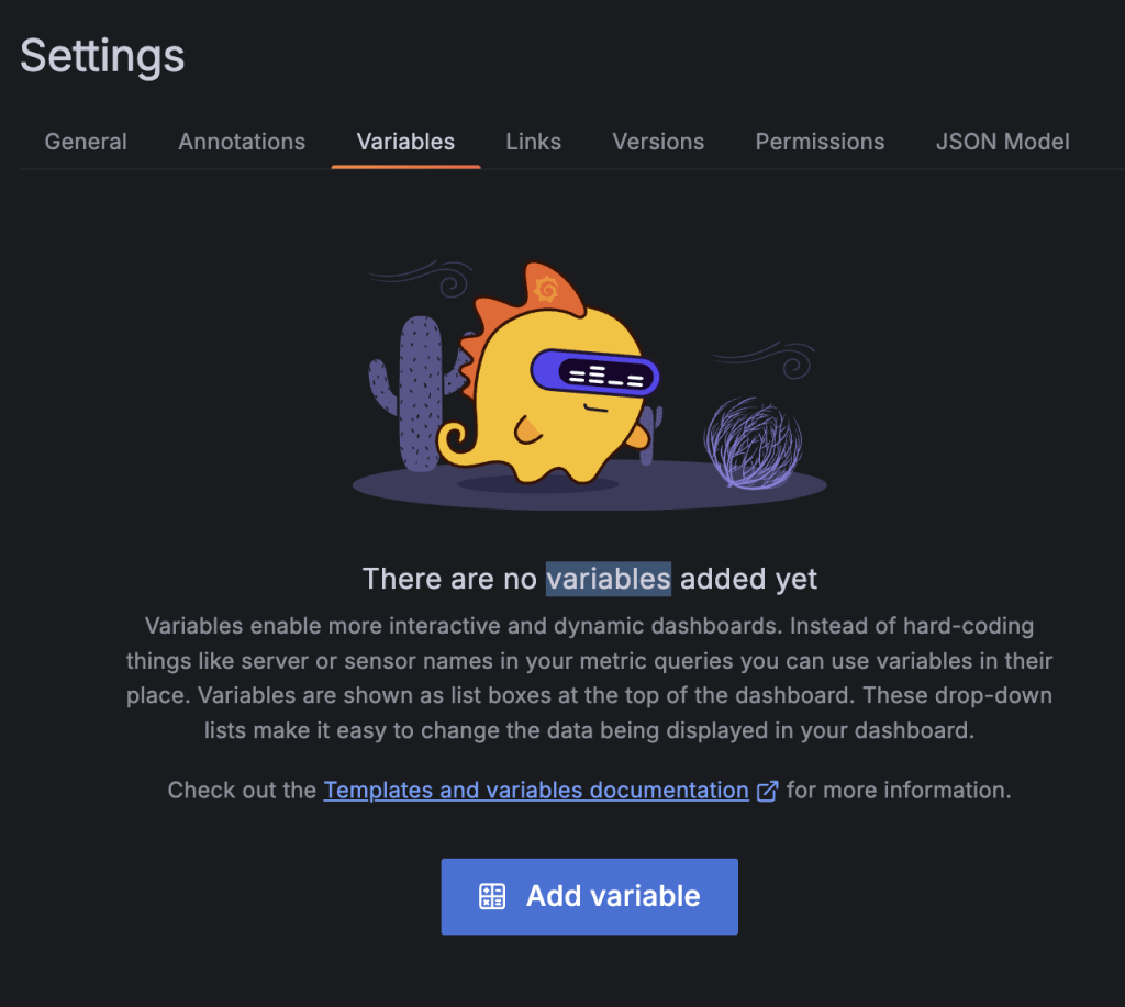 8.2 Add variable configuration and Save Dashboard
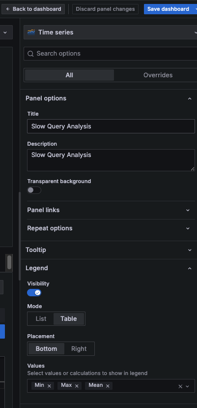
 |
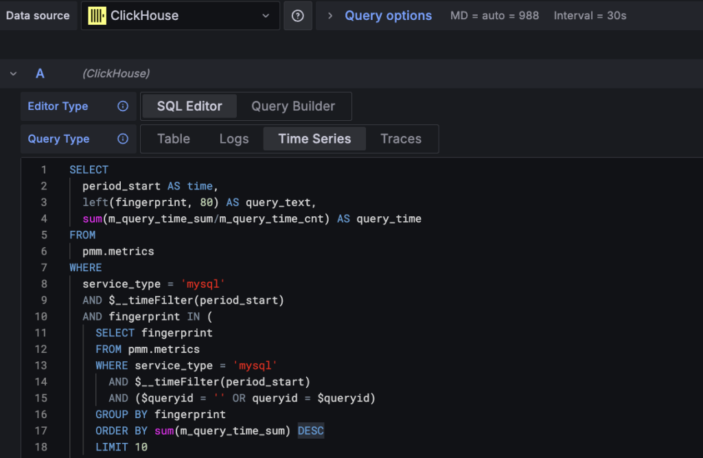
1 2 3 4 5 6 7 8 9 10 11 12 13 14 15 16 17 18 19 20 21 22 23 24 25 |
SELECT period_start AS time, left(fingerprint, 80) AS query_text, sum(m_query_time_sum/m_query_time_cnt) AS query_time FROM pmm.metrics WHERE service_type = 'mysql' AND $__timeFilter(period_start) AND fingerprint IN ( SELECT fingerprint FROM pmm.metrics WHERE service_type = 'mysql' AND $__timeFilter(period_start) AND ($queryid = '' OR queryid = $queryid) GROUP BY fingerprint ORDER BY sum(m_query_time_sum) DESC LIMIT 10 ) GROUP BY time, fingerprint ORDER BY time, query_time DESC |
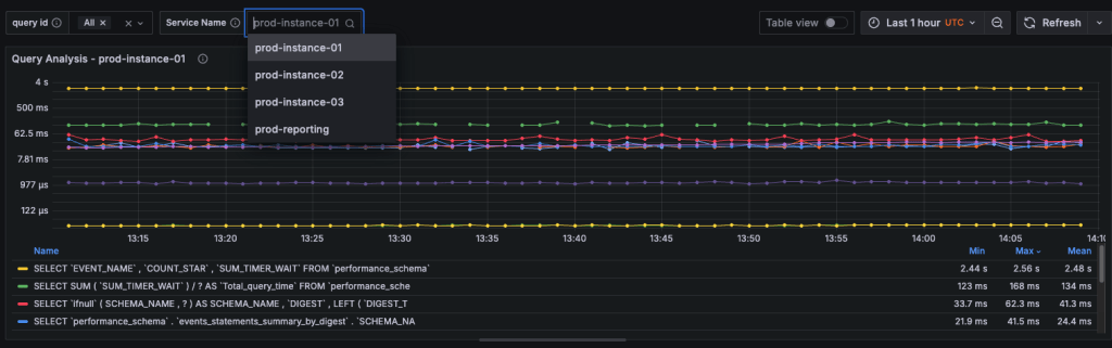
Now, by default this dashboard is plotting top 10 queries. If you have a query fingerprint handy, you may be able to filter the search by that specific query. That said, this is still plotting queries across all the monitored instances. Let’s move on to add the service_name filter.
|
1 |
select distinct service_name from pmm.metrics where service_type = 'mysql'; |
|
1 2 3 4 5 6 7 8 9 10 11 12 13 14 15 16 17 18 19 20 21 22 23 24 25 26 |
SELECT period_start AS time, left(fingerprint, 80) AS query_text, sum(m_query_time_sum/m_query_time_cnt) AS query_time FROM pmm.metrics WHERE (service_name = '' OR service_name = '$service_name') AND service_type = 'mysql' AND $__timeFilter(period_start) AND fingerprint IN ( SELECT fingerprint FROM pmm.metrics WHERE service_type = 'mysql' AND $__timeFilter(period_start) AND (service_name = '' OR service_name = '$service_name') GROUP BY fingerprint ORDER BY sum(m_query_time_sum) DESC LIMIT 10 ) GROUP BY time, left(fingerprint, 80) ORDER BY time, query_time DESC |
I know many of you are naturally curious and enjoy experimenting with PMM and Grafana… So you’ve probably already started thinking about how far this can be taken. Feel free to share your ideas or custom dashboards in the comments.
Sample Dashboards:
Okay, for those who are looking to have quick results, I’ve prepared the complete Query Analysis and Insights Dashboard for you to import and use instantly.
By importing the JSON file, you’ll get the full working dashboard with all panels preconfigured, including:
This allows you to instantly explore PMM Query Analytics data, adjust time ranges and filters, and correlate query performance, contention, and workload behavior without recreating the dashboard from scratch.
Dashboard JSON available here:
Give it a go and let me know if you have suggestions or requests. Also consider sharing if you create something interesting.
Cheers.
Resources
RELATED POSTS