This document is designed to help you access and understand how to apply Percona's brand consistently and effectively across all channels. These guidelines will provide the tools and direction needed to represent Percona's identity with clarity and impact.

On this page you’ll find the official variations of the Percona logo, along with guidelines on how not to use them.
In our brand guidelines, it's imperative that designers prioritize contrast to ensure accessibility and readability across all materials. Whether selecting colors for text and background or choosing graphic elements, maintaining a clear and distinct contrast ensures our brand remains inclusive and impactful for all audiences.
These are the main ones. The purple and the yellow are loud. Use them sparingly. No big swaths. Highlights, headlines, that sort of thing. Black and white give the canvas.
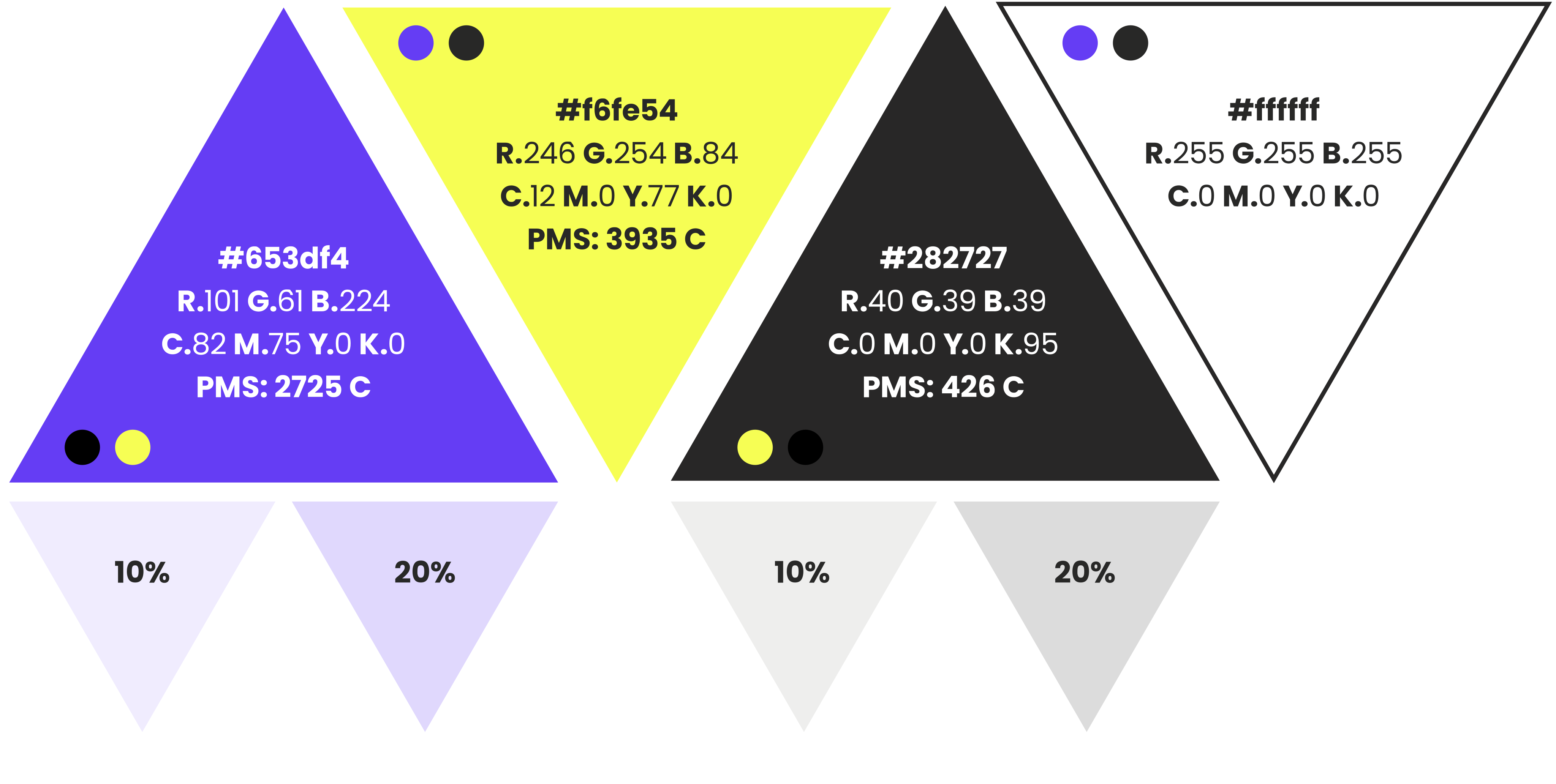
Using tints is acceptable for elements of UI, etc. They should never be used in place of our bold brand colors. For instance, on the logomark or in typography. Tints are for digital use only.
Where Percona offers products and services that relate to other technologies, we have a color aligned with that technology. For accessibility purposes you should only use these colors with the accent color denoted by the circle or circles within each triangle.
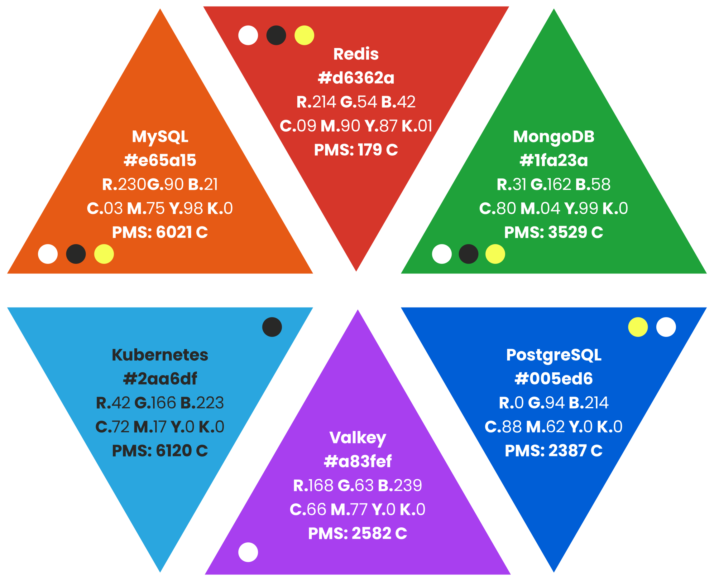
Colored circles on each swatch denote complementary colors that pass at AA normal accessibility.
WCAG Level AA:
WCAG Level AA: