
When checking for how good (or bad) a PostgreSQL instance is behaving, one just wants to see everything that matters on a single-ish page. That’s what the new summary dashboard in Percona Monitoring and Management (PMM) is achieving:
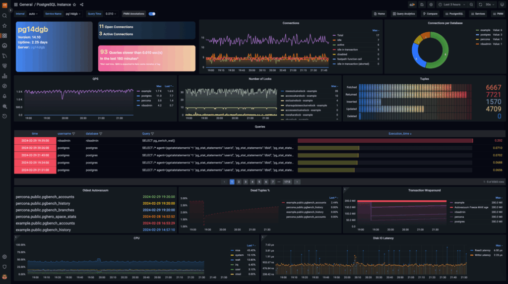
So, what is “everything that matters”? It goes like this:
That list looks like a lot, right? But all that information is what one can see at a glance with the new Summary dashboard, in a simple not-overwhelming approach.
Sections are logically clustered like, for example, bloating info:
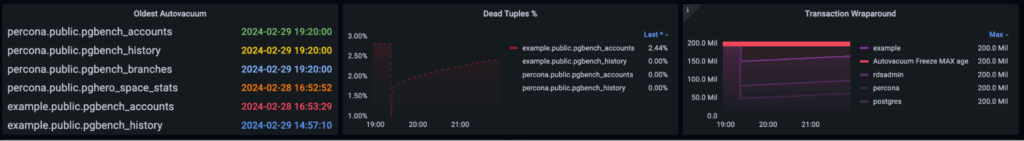
You can now spot tables with autovacuum not running for a long time or tables with an excessive amount of dead tuples compared to the live ones. And to check how close the trx id is to the frozen value.
For the slow log information, two key panels are available: the first one is the dynamic slow query count:
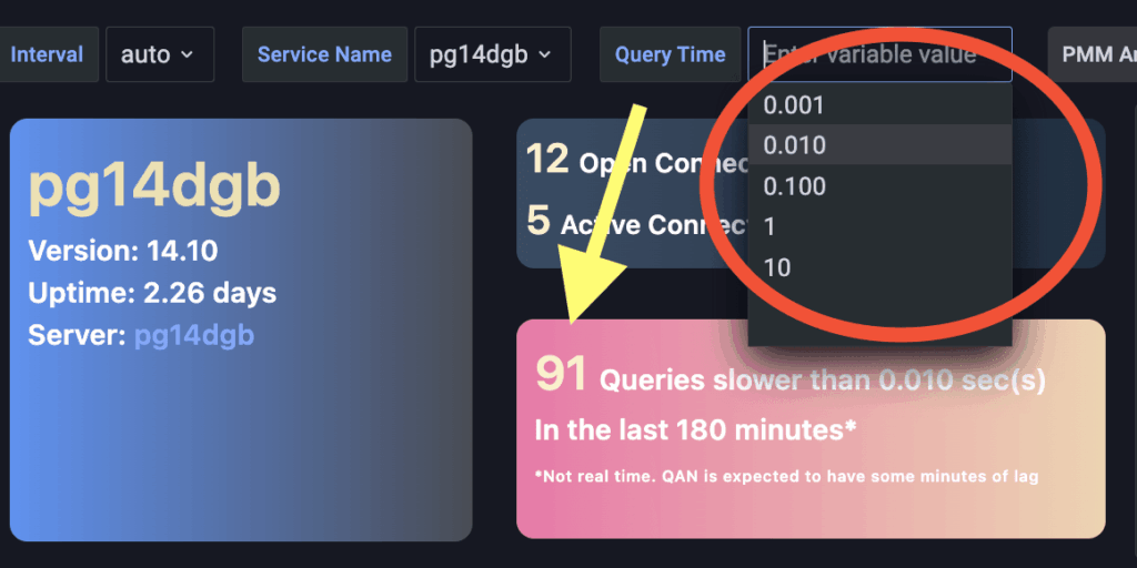
One can choose from a set of thresholds to see how many queries are taking longer in the selected time range.
The second one is the introduction of a Queries panel:
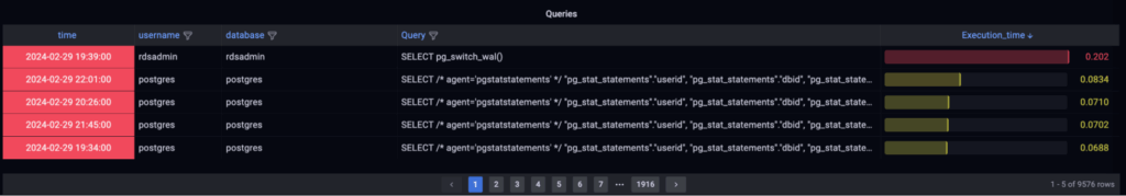
The queries shown are the ones executed during the time range set for the dashboard and ordered by Execution Time (descending) instead of timestamp, so one can easily spot slow queries.
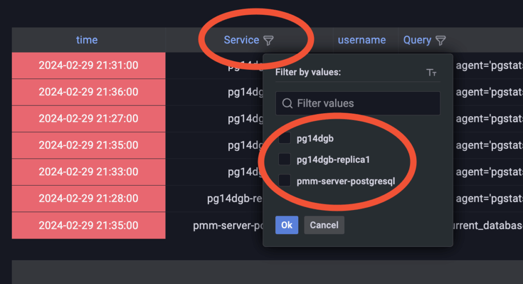
The table can be filtered by different dimensions, such as Service Name:
This new PostgreSQL summary dashboard will be available firstly as an experimental piece of PMM in the release version 2.41.2 and is also available on the PMM Demo: https://pmmdemo.percona.com/graph/d/Q09d8k7Ik/postgresql-instance?orgId=1&refresh=30s
The reason for this is that we want to hear from everyone before making it to GA, so make sure to add comments and suggestions right here in the comment section or in the Percona Forum!
Percona Monitoring and Management is a best-of-breed open source database monitoring solution tool for use with MySQL, PostgreSQL, MongoDB, and the servers on which they run. Monitor, manage, and improve the performance of your databases no matter where they are located or deployed.
Resources
RELATED POSTS